Build Co 7 Draft.
The Problem
Very few brands have the luxury of tracing their heritage back 90+ years. Tigrett & Pennington Insurance is synonymous with “trust” because of the excellence and longevity in which it has served the community. But with longevity also comes the need for a brand to stay fresh. Tigrett & Pennington came to Fifo seeking a visual rebrand, the need to tell their story, and an updated website experience that honored the past and looked towards the future.
The Solution
Fifo needed to thread the needle between history and modernity, expressing the legacy of what was with the vision of what’s to come. We also knew that in order to connect Tigrett & Pennington to the people on the other end of the website, phone, or email, their potential clients needed to know more about how their Insurance brokerage would help them in very real ways, moving beyond a check box into a long-term relationship with trusted partners.
The Results
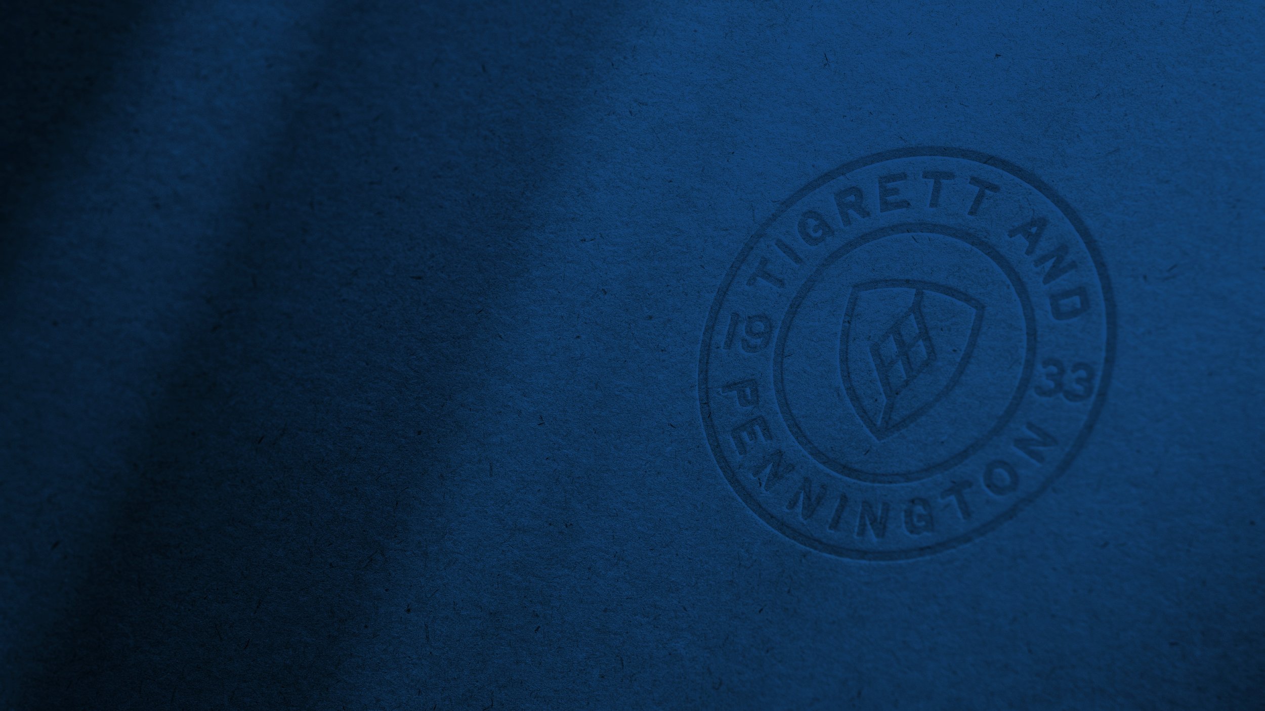
Fifo first created a full-scale visual rebrand for Tigrett & Pennington, drawing inspiration from the Pennington family crest. The shield and diamond portrayed “Safety” and “Excellence” while the strong sans-serif font exhibited characteristics of retro fonts packaged in a modern way. Fifo chose to focus on a sleek mid-century approach and used color psychology that communicated key values of trust and security. Next, Fifo produced a commercial that told client’s real-life stories, evoking an emotional response beyond the intellectual need for insurance. Finally, Fifo completely redesigned their website, creating a user-experience that was easy to use and modern, while reinforcing the impact of their lasting legacy.
Let’s Talk
As much as we love the benefits of a digital society, we are old school at heart
and will always prefer a face-to-face sit down with you, so let us treat you to a lunch,
a coffee, or a stiff drink and hear more about your story!


